WorkLife Pulse 2017 – Survey Results
June 2017
Menno Place uses the Accreditation Canada’s Qmentum program to guide our quality improvement efforts. This involves assessing and improving the services we provide based on Accreditation Canada’s standards.
The WorkLife Pulse tool is an important part of this process. The online survey asks for your opinions on different aspects of your work environment. The results help us identify areas that may need to be improved.
The Process:
A link to the WorkLife Pulse survey was emailed to each regular and casual staff personal or work email on March 24, 2017 with the closing date, May 1, 2017. Reminder emails went out to staff every 2 weeks to ensure maximum participation. The required number of participants were 181 and 215 surveys were received. All were completed on the web site portal.
2017
Menno Apartments – 37
Menno Home – 91
Menno Hospital – 87
Total – 215
2015
Menno Apartments – 25
Menno Home – 73
Menno Hospital – 71
Total – 169
The survey consists of 30 questions. The answers to the questions could result in three categories:
- Green flag – Two columns representing the top two positive answers are added and the sum of those two is greater or equal to 75%. Indicates areas that do not require improvement at the time of the report.
- Yellow flag – Two columns representing the top two positive answers are added and the sum of those two is more than or equal to 50% but less than 75%. Indicates areas where some improvement may be required.
- Red flag – The columns representing the top two positive answers are added and the sum of those two is less than 50%. Serves as an alert to the organization. These should be reviewed and determine which ones require further investigation and improvement. Where improvements are necessary, an action plan is recommended.
The Results: Menno Place Overall Results:
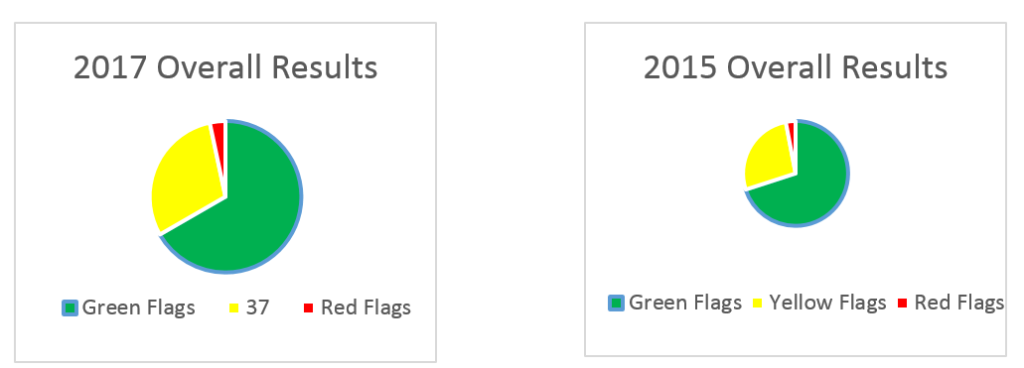
| Green 60% | Green 70% |
| Yellow 37% | Yellow 27% |
| Red 3% | Red 3% |
Compared to the results of 2015 the finding show a decrease of green flags by 10%, an increase of yellow flags by 10% and equivalent red flags.
Comparison of Location Breakdown 2014 – 2015 – 2017
| 2017 | Survey’s Submitted | % Green | % Yellow | % Red |
| Hospital | 87 | 50% | 47% | 3% |
| Home | 91 | 43% | 53% | 3% |
| Apts | 37 | 77% | 20% | 3% |
| Total | 215 |
| 2015 | Survey’s Submitted | Green | Yellow | Red |
| Hospital | 71 | 63% | 30% | 7% |
| Home | 73 | 60% | 37% | 3% |
| Apts | 25 | 77% | 20% | 3% |
| Total | 169 |
RED FLAGS to be given attention:
Menno Hospital Q30 Overall, how would you rate your organization as a place to work?
Excellent 27.6%
Very Good 20.7% Excellent to Good 85.1%
Good 36.8%
Fair 11.5%
Poor 3.4%
Menno Home Q 19 Senior managers act on staff feedback
Strongly Agree 16.5%
Agree 27.5%
Neutral 19.8%
Disagree 13.2%
Strongly Disagree 23.1%
Menno Apts Q19 Senior managers act on staff feedback
Strongly Agree 11.1%
Agree 36.1%
Neutral 44.4%
Disagree 8.3%
Strongly Disagree 0%
The Action Plan: The results of the survey will be shared on the Menno Place Staff Newsletter. As well, managers and supervisors will share the results of the 2017 WorkLife pulse survey with their teams and seek feedback on how to improve on the statement which resulted in a red flag. The recommendations will be reviewed with the Leadership Team for follow up.
Please see the following document for a detailed breakdown of the survey results from each location – Survey Results by Location
Thank you all for your participation as we seek to improve our work/life balance to enhance your work and life experience.